What have you learnt from completing this task?
In completing this task, I have learnt several things. I initially learnt while doing the Photoshop refresher, how to use several tools that I hadn't used before. For example, I found that the Polygon Lasso tool was the best thing to use when cutting out an image, especially if the object in the image that I want to cut around doesn't have straight edges. Finding this out allowed me to cut around the person in my image to place it on my cover. As well as this, I learnt how to show my work in a now form. Previously when studying media at GCSE, we were given folders to display our work so for me, learning how to display my work on a blog was one of the most useful things I had to learn.
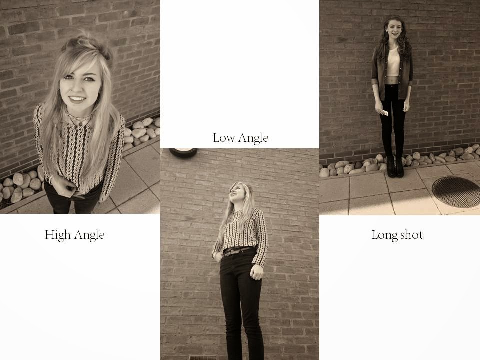
I also learnt that you must plan and research other magazines that are the same genre that you are creating. This is because you need to clearly know what conventions go where when it comes to creating your cover. From completing this task, I also learnt how to frame an image. As well as this I learnt 10 new types of framing and where it is appropriate to use them in a magazine. This allowed me to gain extra knowledge for when it comes to the next part of the course in creating a music magazine.
How have you used technology?
In this task, I used various technological devices for various things. For the actual production part of my front cover and anything photoshop related, I used a MAC which I had never used before. This is because MAC's are created for the editing aspect so the programming allowed the creating process a lot easier to get my head around and come out with a final product. I also used my mobile phone to take the 10 framing images with. Because it was my own mobile phone and I understood how the camera works, this allowed me to concentrate on how I was framing the image and that wasn't overtaken by how to use the camera. As well as this, I also used a camera to take the image for my front cover. This is because the quality is much better than one of a mobile phone so it's better to look at than a phone image which allowed me to make my front cover look appealing. As I took the images on a camera, that meant I had to get them on a computer to edit. I did this via an SD card. I had to put the SD card into my home computer before putting it onto a memory stick.
What conventions have you used and why?
I've used many typical conventions of a magazine such as a masthead, skyline, plug and feature stories. I did this to make my magazine look more realistic. I also did this so that people could clearly tell that my product is a magazine front cover rather than a poster etc. I also used these conventions along with the colour scheme of fairly light colours and a main image of a college student to help the audience know the genre of the magazine just by looking at it.
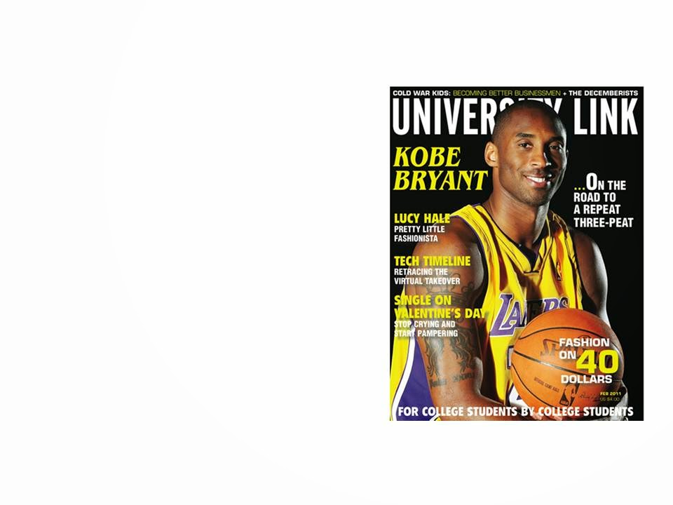
For example, an actual magazine looks like this. and as I wanted my magazine to look realistic, I followed the conventions in place and my magazine cover looked like this.


I made sure that my cover had a skyline in place at the top of the page, a plug somewhere on the page that matched the colour scheme, and the feature stories down the side of the page.
I moved the placing of my main image and feature stories in my actual magazine to how they were in my drafts because when I took my image, it was framed differently. This is because rather than having my masthead as one straight line, I had the first word right at the top of the screen and the second word starting half way across the page just underneath. Because of this, I thought that my image will look better if the person in my image fills the space underneath the first word of my masthead, so due to this i had to change the layout of my outcome.
What would you change if you were to do this task again?
Overall, I'm very happy with how my product turned out, however, if I were to do this task again, I would be more organised. I would make my plans and drafts more detailed and I would also plan my photo shoots and images a lot more. As well as this, I'd have made sure that my image on my cover was brighter to make it stand out more. Although I wanted my background to be blurred, I felt like this overpowered my actual image and that issue would be fixed with my image being brighter. I would also spend more time finding more interesting fonts to use for my feature stories.


.jpeg)
.jpeg)
.jpeg)